Valorian. Brand Positioning & Identity Design
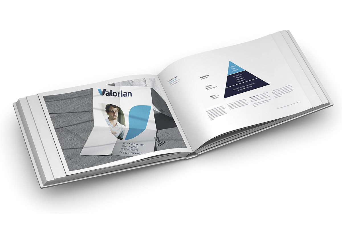
We rebranded the Fasga Union Syndicate as Valorian following the merger with the Professional Travel Union (SPV) and the Professional Insurance Union (SPS). The fundamental objective for the brand change was to incorporate a differentiating value that concentrates on the new Brand the values and reputation that has allowed them to be a reference in the more than 60 companies in which they are present.
With this decision, Valorian increases synergies and its negotiating capacity, adding value to trade unionism, increasing the productivity of organizations, and improving the quality of work and work environments, amongst others.
The name we created reflects the fundamental concept of «value», understood as Values as well as Valour. The visual concept is also a reflection of the same idea.
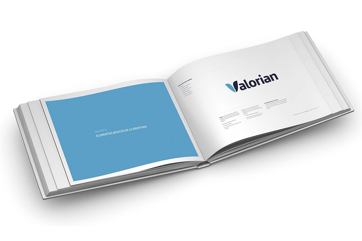
The symbol, integrated into the name, suggests the shape of a shield made up of 2 parts, representing, on the one hand, the union and its affiliates, and on the other, the client company and its management.


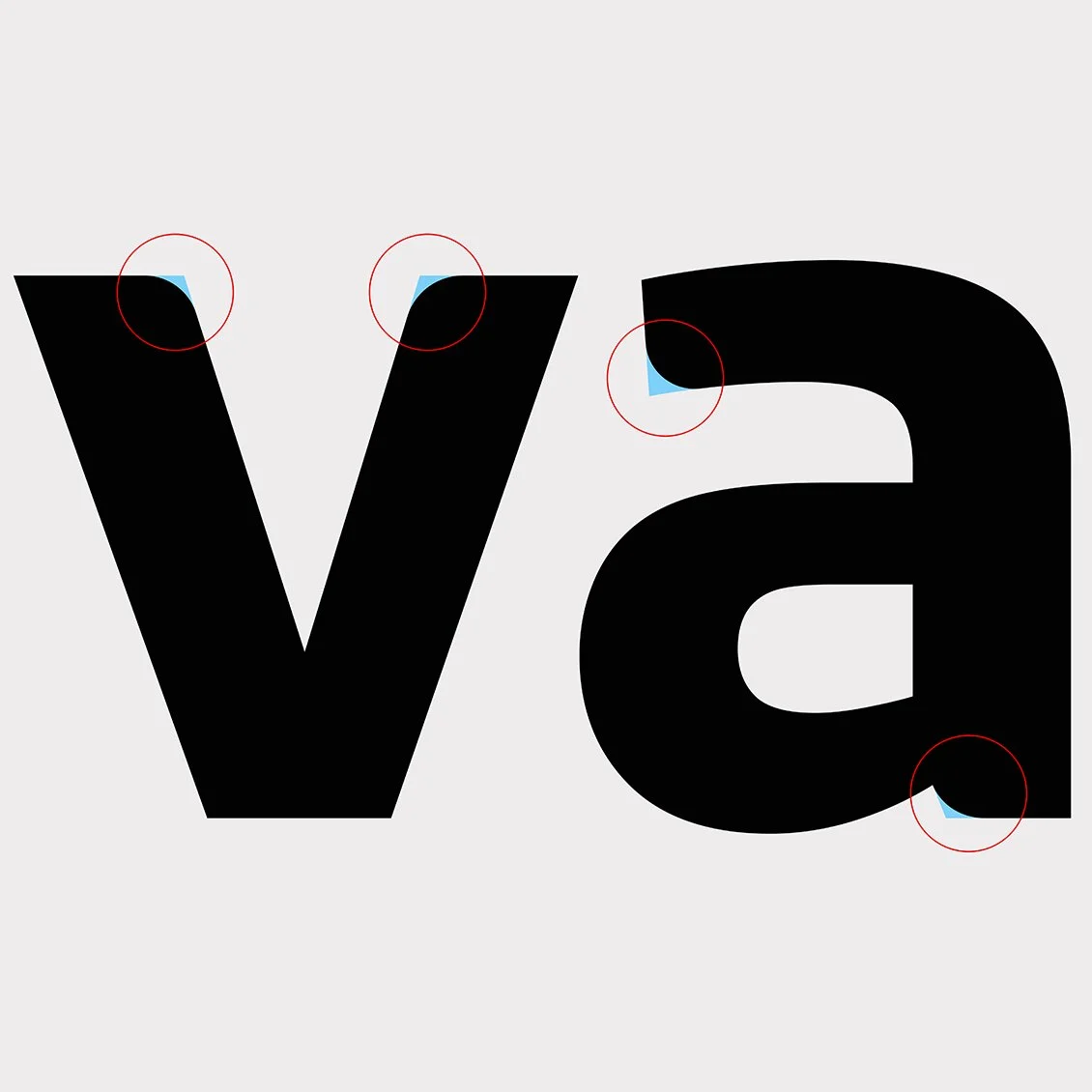
The logo has clean lines that harmonize curves and sharp angles. The latter’s definition represents professionalism and efficiency. The curves soften the logo somewhat to reflect closeness and attention to people, which have characterized the union throughout its history.
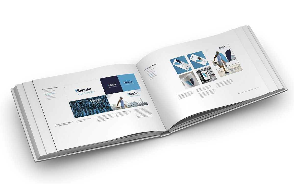
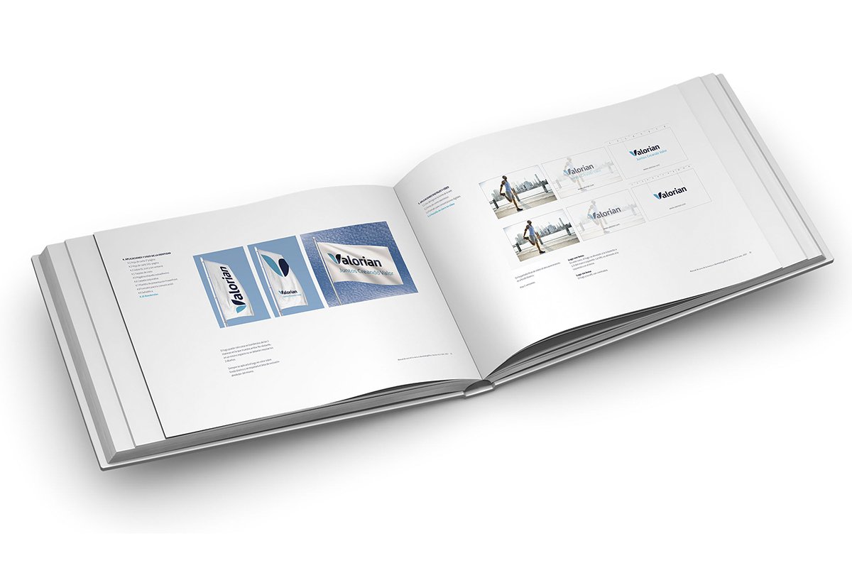
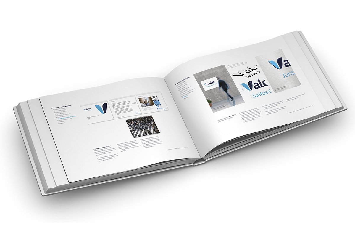
With the logo as a starting element and to achieve an exclusive brand footprint, we developed a distinctive look & feel and designed the most representative and visible elements of the digital and analogue identity.
As seen in these examples, the symbol can be used as a supergraphic or graphic container for imagery, greatly increasing the potential of the identity.
