Repositioning a Technology Brand
Indizen Optical Technologies (IOT) is a company that provides its business partners with the technology and services they need to make the best lenses in the world. It has an international presence, with four technology centers located in Madrid, Spain, and Torrance, California, USA. Its founders saw the potential to create differentiating solutions for the ophthalmic industry, combining product development and design with comprehensive support in to-market strategy.
Building on IOT’s 4 core strengths we identified, we set out to redefine the brand proposition as a foundation for its core message moving forward.
Project objectives:
As one main objective, IOT wanted greater visibility for its brand. Due to the organization’s rapid growth, management felt that many of its achievements were not sufficiently recognized and that its brand was not strategically managed or well-positioned. Our assignment included updating the brand positioning, the visual identity, the brand architecture, key messages, and creating style guides for creating communication elements to properly manage the brand into the future.
With its brand repositioning, IOT is now better prepared to communicate its core competencies to its primary audience: its technology partners in the lens manufacturing industry.
The program was developed in 4 phases throughout the year 2021
Phase 1. Strategic analysis and brand platform
We analyzed the company’s and all relevant market information to define a legitimate, differentiated, and enduring brand platform, and recommend the degree of evolution for the identity.
Phase 2. Visual and verbal identity design
IOT management wished to relaunch the brand but not replace the existing logo. With this limitation, we redefined the basic elements of the visual identity: usage of the logo and slogan, colors, fonts, etc. We developed the look & feel and visual styles for photography, illustration, typography, and graphics.
We also created a verbal narrative for the identity, summarized in a new tagline «see the difference» and in key messages to consistently express the brand’s values, attributes, and personality.
Phase 3.1 Brand Architecture
We organized the relationship between the master brand and the organization’s other brands, including those of its products and non-commercial initiatives.
Phase 3.2 Design and development of brand applications
We applied the revised identity and look & feel to the design and layout of key analog and digital communications: stationery, presentation formats, layout grids, web, intranet, extranet, catalog, corporate video, and welcome pack.
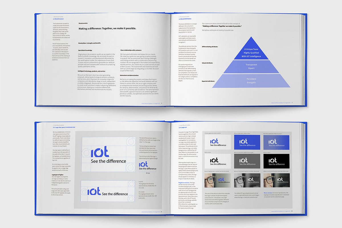
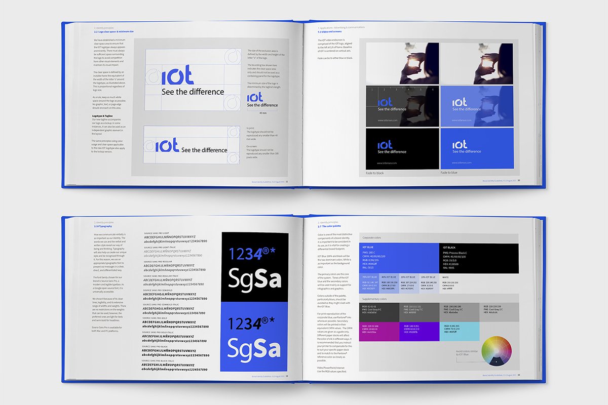
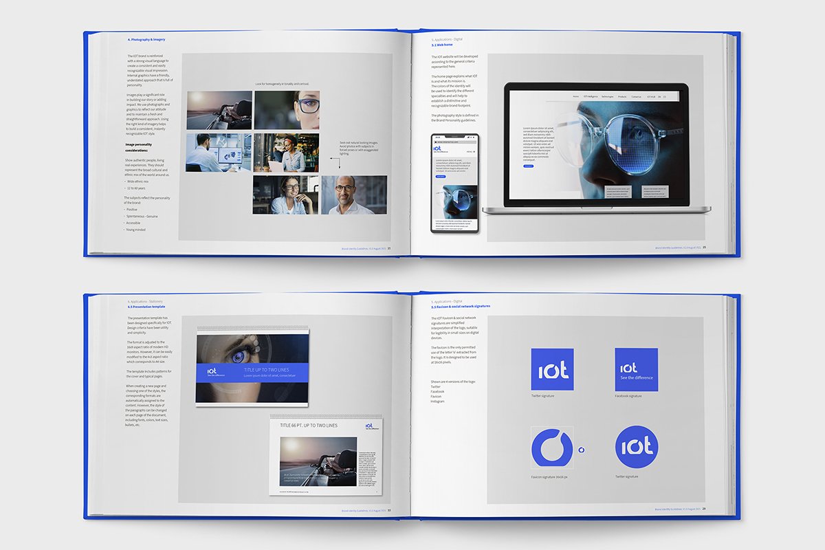
Phase 4. Brand Manual
As a final deliverable, we documented the recommendations in user guides.
Once we had fully explored and tested the brand relaunch guidelines, we worked side by side with the IOT marketing and design team in Madrid to develop the initial communication pieces. These included the product catalogs and dossier, and the corporate video and presentation.


